Technology
Sakshi
Jan 16, 2026
When you think about dashboards, the first image that probably comes to mind is your car. A quick glance tells you how fast you’re going, how much fuel you’ve got left, and whether that mysterious warning light is something you should worry about right now or put off until later. Dashboards are built for speed and focus.
If you’ve been in market research long enough, you’ll remember when reports meant waiting for surveys to close, for data to be cleaned, and for a thick PowerPoint deck to land in your inbox. By the time results reach decision-makers, the market often shifts.
In this Early Stage, dashboards weren’t much more than digital scoreboards. You would log in and see bar charts, pie charts, and maybe a completion rate. Updates came in overnight batches or worse, through manual uploads. By the time you looked at the numbers, they were already out of date. Don’t get me wrong, compared to juggling twenty Excel sheets it felt like magic. But really, it was just a snapshot. You could see the data, but you couldn’t dig into it and then you were always a step behind reality.

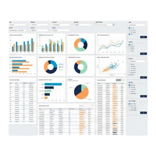
In the Mid-Stage, Then came the “self-service” era. Suddenly dashboards became interactive. You could filter by segment, drill into specific groups, and refresh automatically without asking someone in ops to pull the latest export. This was a game-changer. Stakeholders didn’t need to wait for weekly updates, they could explore the numbers themselves. Researchers could finally focus more on what the data meant instead of formatting endless reports.
But here’s the thing: these dashboards were still mostly descriptive. They showed you what had happened, but not why. And sometimes all that interactivity was more confusing than helpful, especially for people who just wanted the big picture.
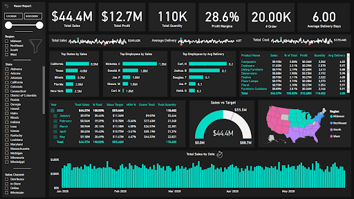
In the Modern Stage, what began as clunky executive information systems in the 1970s and 80s evolved into powerful tools for consolidating and visualizing data. The real breakthrough came in the early 2000s when tools like Tableau, Power BI, and Qlik made dashboards interactive, customizable, and fast. That’s when the research industry realized dashboards weren’t just a technical innovation but also a way of reimagining how insights could be delivered.
Pauwels and colleagues (2009) described dashboards as essential for aligning metrics with business strategy. Yigitbasioglu and Velcu (2012) highlighted how they enhance decision-making by making complex data cognitively easier to process. Rossi et al. (2025) argues that dashboards only succeed if they are human-centered, relevant, intuitive, and embedded into daily workflows.
Even as dashboards have evolved, some challenges persist. The first is information overload. More real-time data does not always mean better insights sometimes it just means more noise to filter through. Another issue is alert fatigue. When every change triggers a notification, it becomes harder to know which ones truly matter.
Then comes the question of trust. AI-driven insights and automated flags can be powerful, but they still need human interpretation. Without context, a machine-generated “insight” can mislead just as easily as it can help. And finally, there’s adoption. Not every stakeholder is ready to embrace interactive or predictive dashboards. Some still default to static reports, even when better tools are available.
These challenges don’t diminish the value of dashboards, but they remind us that technology alone is not the answer. The real value comes when dashboards are designed thoughtfully, used consistently, and always paired with human judgment.
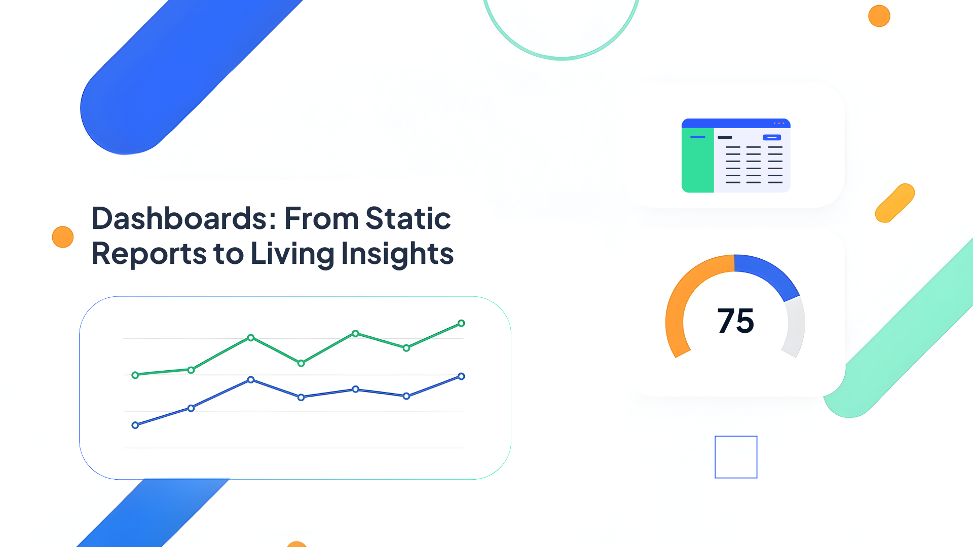
Q-Fi: Turning Data Into Direction
At Q-Fi, we’ve taken this to heart. Dashboards aren’t just a side feature, they're central to how we think about research software. Our Survey Health Dashboard gives you a live pulse of your project completions, dropouts and device breakdowns so that you know right away if things are on track. The Report Builder makes it easy to create and share custom views without having to export into another tool. The Quali-Fi Dashboard helps you manage qualitative communities and panels, tracking engagement and growth over time. And the overall Q-Fi Dashboard ties everything together so you always have a clear view of what’s happening across surveys, communities, and reporting.

Dashboards began as a way to tame overwhelming data, but they’ve grown into something much more important. When they’re done right, they don’t just display information, they guide decisions. That’s the philosophy behind Q-Fi’s approach: give researchers clarity, confidence, and control. Because at the end of the day, the real value of a dashboard isn’t in the charts themselves, but in the choices they help you make.
%20(6).avif)
Market Research
Sakshi
Oct 22, 2025
Read full blog
.png)
.jpg)
Trends
Andrei
Oct 16, 2025
Read full blog
Discover what’s possible with intuitive tools for surveys, communities, and reporting built for real research.
Built for research by research professionals.
Providing solutions to research agencies, marketing agencies, internal research teams, government, educational institutions, solo researchers and everyone in between.
Copyright ©2025 | Q-Fi Solutions Inc.


%20(8).avif)
.png)